There Is a Frequency That the Wealthiest Families Have Used for Generations and Most People Will Never Know It Exists
>>> Open the Door <<<

It’s incredibly annoying when a key button or piece of text vanishes just off the edge of your phone screen. You reach for an option, but it’s hidden behind that camera cutout or the curved glass. This problem appears often now because modern phones, whether iPhone or Android, feature unique screen designs like notches and punch-holes. Some essential elements disappear because the app doesn’t know how to properly fit itself onto these newer displays. This guide shows you exactly how to fix those cut-off edges. We’ll walk you through simple adjustments so you can restore full visibility to every app on your smartphone. You’ll get your screen space back where it belongs.
Understanding Why Your App Edges Are Getting Hidden
When you update your smartphone or an app itself, you expect everything to look picture-perfect. However, sometimes essential parts of an application disappear, hidden just out of sight at the edges of your screen. This frustrating layout issue isn’t usually a reflection of a problem with your specific smartphone hardware. Instead, it often points back to how applications are coded to interact with the increasingly complex shapes of modern phone displays. For many users, the culprit lies in the developer’s failure to account for areas the operating system reserves for itself or areas obscured by physical phone design. We must look at both app design intentions and device realities to figure out why your view is cut off.
The Screen Curve and Notch Problem: Safe Areas Explained
You might notice that modern phones rarely have flat, uniform bezels anymore. Instead, we see curved glass corners, aggressive notches, or small punch-hole cameras interrupting the display. App developers must account for these physical intrusions. They do this by respecting what designers call Safe Areas.
Simply put, a Safe Area is a designated region around the perimeter of the screen where the operating system guarantees that no critical system elements will appear. These mandatory boundaries protect things like the clock, battery indicator, and, most importantly, areas where the physical hardware interferes with viewing. On an iPhone, this includes the area around the Dynamic Island or notch, and near the corners where the screen curves meet the frame. On Android, it involves areas near the front-facing camera or the bottom navigation bar indicators.
Thousands of People Were Struggling With Money Until They Discovered This One Ancient Secret Hidden in Sound
>>> Unlock It Now <<<

If an app designer fails to implement these safe areas correctly, they risk crucial content falling into what we call the display cutout zone. Imagine putting critical navigation buttons right where the camera lens sits; these buttons become unusable. The developer needs to tell the phone operating system, “Keep my important buttons (like ‘Save’ or ‘Back’) outside this invisible zone.” When this coding step is skipped, the content might be there, but your smartphone display physically blocks it. Developers must actively code their views to be inset from the edges to avoid this invisibility cloak effect. You can read more about how these zones are changing in operating systems, like how Android is defaulting to more edge-to-edge layouts, requiring developers to adapt their understanding of these boundaries [https://dev.to/abhivyaktii/android-15-and-safe-areas-why-apps-feel-different-now]. Understanding these underlying requirements helps explain why some simple apps still have trouble displaying correctly.
When Old Apps Meet New Screens: Hardwired Dimensions
Not every application gets updated frequently. If you are using an app that hasn’t seen a significant update in several years, its display logic might be stuck in the past. This is a common source of cut-off edges, especially when transitioning from an older phone format to a taller, newer one.
These older applications often contain hardwired dimensions. This means the programmer coded the screen elements to match the exact pixel dimensions of the phone they were targeting when the app was first released, perhaps a standard 16:9 aspect ratio. When you run that same application on a modern smartphone that might have a taller 20:9 aspect ratio, the app simply doesn’t know how to adjust. It acts like it’s still running on the small, old screen. The result is obvious: the application content looks like a small box centered on your large screen, or worse, the extra space stretches things incorrectly, pushing content off the visible edges. This isn’t a setting you can easily change; it is a fundamental programming limitation of that specific app version. For these legacy apps, the only real fix is waiting for the developer to release an update that supports modern screen scaling. It requires developers to use flexible layout systems instead of fixed pixel measurements, a shift that didn’t happen overnight across the entire industry.
Display Zoom and Size Settings Messing Up App Layouts
Sometimes, the problem isn’t the app’s age or the core design; it’s the settings on your phone itself. Both major mobile operating systems allow you to globally adjust how large things appear on your screen. If you made these adjustments and didn’t notice, you might have inadvertently forced certain apps to break their own layouts.
This situation is particularly widespread on Android devices due to the granular control over display density, often called DPI (dots per inch) settings, or the dedicated Display Size setting. When you increase the display size or change the screen density to make text and icons bigger across the entire operating system, some apps may not handle the increased scale well. They attempt to render their content based on the new, larger scale factor provided by the system, but their internal layout structures haven’t been designed to support this massive change. This forces content beyond the physical boundaries of the screen window allocated to the application.
Here is what you should check if you recently changed screen appearance settings on your smartphone:
There Is a Frequency That the Wealthiest Families Have Used for Generations and Most People Will Never Know It Exists
>>> Open the Door <<<
- Check Display Size: On Android, go to Settings, search for Display Size, and confirm it’s set to the default or a size you are comfortable with. See if making it smaller fixes the issue in the problem app.
- Inspect Font Size: While less common for physically cutting off content, excessively large font sizes can sometimes contribute to text overflowing its container, pushing other elements off the edge.
- Look for Zoom Settings: Some devices have a separate “Screen Zoom” feature that functions similarly to display size adjustments. Verify these visual aids haven’t been maximized.
If you recently adjusted these settings to improve readability, try resetting them one by one. If the app works perfectly at default settings but breaks when you enlarge the display, you’ve found the source. The app simply doesn’t scale correctly when told the screen elements should be larger than standard.
iOS Fixes: Adjusting iPhone Display Scaling for Full View
Many users encounter screen issues on their iPhone where app content appears partially hidden or clipped at the edges. This often occurs because the operating system’s scaling behavior conflicts with how an application expects to present its interface. Unlike many Android adjustments that involve density changes, iOS handles visual scaling more uniformly, usually defaulting to one system-wide setting that affects all apps. If your smartphone is displaying cut-off elements, there are specific locations within the iPhone’s settings you need to check before assuming a faulty app update. We will examine these system controls that directly influence how elements fit onto your screen, helping you regain that lost real estate.
Checking for iPhone Zoomed Display Settings
One common culprit for seemingly random clipping on an iPhone involves the built-in accessibility and view settings. The primary function that changes the visual scale of everything on your screen is called Display Zoom. When this feature is active, it overrides the default scaling, making all text, buttons, and interface elements larger. While this is helpful for many people who prefer larger text, it can sometimes cause poorly optimized apps to push content beyond the physical boundary of the screen.
To diagnose if this is causing your issue, examine the Zoomed View setting:
- Open the Settings application on your iPhone. Remember, this is the gray icon resembling gears.
- Scroll down and tap on Display & Brightness. This menu controls all aspects of how your screen looks, including light levels and text appearance.
- Keep scrolling down past controls for Dark Mode and Night Shift. You are looking for the section titled Display Zoom.
- Tap on View, which is located directly beneath the Display Zoom heading. You will typically see two choices: Standard and Zoomed.
- If Zoomed is selected, the operating system is essentially rendering content at a lower effective resolution to make everything appear physically larger. Select Standard if this option is currently active.
After choosing Standard and confirming the change, your iPhone will briefly restart its display configuration. Once back to normal, launch the problematic application. If the edges are no longer cut off, adjusting the display zoom setting to Standard restored the expected application fit. It’s a simple toggle that affects the entire smartphone experience. You can find general guidance on managing these display and text sizes from Apple Support [https://support.apple.com/en-us/111773].
Forcing iPad Apps to Resize on iPhone Screen
Occasionally, users install an application that was originally designed only for the iPad but is being run on an iPhone. Modern iOS allows this backward compatibility, but the application might not translate well to the taller, narrower iPhone screen dimensions. If you notice an app looks stretched, strangely proportioned, or has content vanishing at the edges, it could be attempting to render itself using an iPad layout checklist. This problem is less common with continuously updated apps but frequently surfaces with older, utility-style software or specialized tools that haven’t received an iOS-specific overhaul.
When an application tries to run its iPad layout on your iPhone, it treats the screen as if it were much wider than it actually is, leading to content overflow. Here is how you can sometimes force the iPhone to handle that iPad scaling differently:
- Check In-App Settings: Some developers anticipated this cross-device usage and built a manual override into the app itself. Open the application, go to its internal settings menu (often represented by a gear icon inside the app, not the main iPhone settings). Look for options like View Mode, Screen Layout, or Use Native Scaling. If you find a prompt to switch from an iPad view to an iPhone view, select the latter.
- Forced Reinstallation/Update: If the app is compatible with your current iOS, sometimes a fresh start resolves scaling confusion. Delete the application entirely from your smartphone, perhaps restarting the device, and then reinstall the latest version from the App Store. If the developer has recently released an update, this ensures you get the currently supported scaling logic. Disabling any features intended to mimic an iPad size within the app settings should remain prioritized, however.
If you cannot find an in-app setting and the developer hasn’t updated the software in years, you might be stuck. The operating system forces a certain degree of compatibility, but it cannot magically rewrite the developer’s fundamental spatial instructions for rendering elements on a screen that has different physical aspects than what the app expects.
Android Solutions: Taming Display Size and Full-Screen Modes
When you are dealing with an Android smartphone, you have access to a large number of customization options that govern how apps look and behave. This fine-grained control is a double-edged sword; while it allows for great personalization, it also introduces more ways for an app’s boundaries to get misplaced. If you see content disappearing, the fix is often found buried within the system’s visual scaling or display cutout protocols rather than within the individual application itself. We need to systematically check these system-level configurations to restore the proper display area for your applications, ensuring that every button and text element stays within view on your smartphone.
Adjusting Android Display Size for Pixel Perfect Fit
One of the most frequent causes for content falling off the edges involves the main Display Size setting. This system-wide adjustment dictates how large or small all interface elements appear on your screen. If you previously magnified everything to make reading easier, you might have inadvertently told applications they have less functional space than they actually do, causing them to push critical elements outside the physical edge of your screen. Imagine wearing reading glasses that are far too strong; the world seems much bigger, but you lose peripheral vision.
To correct this oversight and bring those hidden buttons back into the light, follow these steps to check and reset your Display Size:
She Pressed Play on a Strange Audio Track and Within Days Her Financial Reality Started Shifting in Ways She Could Not Explain
>>> See How It Works <<<

- Access your device’s main Settings menu.
- Look for the Display or Screen section. This is where most visual adjustments live.
- Locate the specific option labeled Display size or sometimes Screen zoom.
- Observe the slider setting. If it is set toward the larger end, reduce the size slightly. You don’t necessarily have to return it to the absolute minimum, but sliding it back toward the default or standard mark should reclaim the lost screen space.
If reducing the display size immediately resolves the cut-off issue in the affected app, you have confirmed the cause. The application wasn’t designed to handle the extremely large scale provided by that maximum setting. For many modern Android phones, developers expect the scale to remain close to factory defaults, as detailed in recent updates regarding how insets are handled [https://medium.com/androiddevelopers/insets-handling-tips-for-android-15s-edge-to-edge-enforcement-872774e8839b]. A slightly smaller scale often resets the application’s layout calculations correctly.
Controlling App Display Over Notches: Cutout Settings
Modern Android devices often feature a small lens cutout for the front camera, which interrupts the top edge of the screen. Developers must explicitly tell the Android operating system how they want their app to behave around this intrusion. If an app is being clipped, it might be because the system is imposing a default safe area, but the app is trying to draw content into that protected zone. Fortunately, Android provides a dedicated setting to override this behavior on a per-app basis for compatible devices. This allows you to force an app to utilize the space around the camera notch.
You manage these specific exclusions through settings designed to handle display cutouts. Here is the general path to find these options:
- Go to Settings.
- Search for or navigate to Display settings.
- Look for an advanced option such as Display cutout, Notch settings, or Full screen apps. This location varies slightly depending on your device manufacturer’s customized overlay.
- Once in the cutout settings, you often find a list of installed applications. Select the application that is experiencing cut-off edges.
- You will usually have options like Full, Standard, or Use device default.
You should test both the ‘Full’ and ‘Standard’ modes for that app. Choosing ‘Full’ tells the app to ignore the system’s suggestion for the cutout area and draw edge-to-edge, which might solve your clipping issue if the app has its own internal logic to avoid the physical camera. If ‘Full’ causes the app to clip content behind the physical camera, switch it back to ‘Standard’ and check if the issue persists. This toggling helps diagnose whether the problem lies with the app trying to use the cutout space or the system preventing it. Ensuring developers support these cutout definitions correctly is part of maintaining a functional appearance on your current smartphone.
Restarting Apps and Checking for Full-Screen Flags
If diving into display and cutout settings doesn’t immediately solve the problem, sometimes the simplest troubleshooting step is the most effective: a clean restart for the application. An app can sometimes retain erroneous layout data in its active memory session. Fully closing and relaunching the program forces it to rebuild its interface from scratch based on the current system settings. You can find simple guides on how to properly force close apps across different versions of Android [https://www.wikihow.com/Restart-Apps-on-Android].
Here are the basic steps to try this quick fix:
- Force Close: Open your recent apps view (usually a square button or a swipe-up gesture). Swipe the problematic application card completely off the screen to terminate its background process.
- Relaunch: Open the application again directly from your home screen or app drawer.
If the margins are still off after a restart, the issue is likely a persistent configuration mismatch. A second place to investigate is within the app itself. Many modern applications designed for edge-to-edge viewing include an in-app toggle switch, sometimes labeled Full Screen or Edge-to-Edge View. This setting overrides or works in conjunction with your system display settings. Developers often include this so users can opt out of the expanded view if they prefer traditional padding. Check the app’s designated options menu, usually represented by three dots or a gear icon inside that specific application, to see if enabling an in-app full-screen flag solves the cutting-off problem that the system settings could not address.
Troubleshooting When System Fixes Don’t Work: App Updates and Cache
After you have adjusted your phone’s system settings—checking display zoom on iOS or display size on Android—and the cut-off screen issue persists within a specific application, the problem likely lives inside that application’s stored settings or outdated code. You’ve confirmed your smartphone isn’t causing the issue generally, so now we focus on the individual app acting up. Sometimes, a quick software refresh externally, or clearing out forgotten temporary files internally, is required to force the app to recognize the current screen boundaries of your device. We move from configuring the phone to configuring the application itself.
The Quick Fix: Updating the Problematic Application
Application developers are constantly working to support new versions of iOS and Android, and part of that work involves updating how their app respects screen real estate, especially the display cutouts and safe areas. If your app hasn’t been updated in a while, it probably contains programming that doesn’t recognize the shape of your modern smartphone. Developers frequently release updates specifically to fix these hardcoded dimension bugs that crop up when older software interfaces meet newer hardware designs. Always check for updates first, as this is the most comprehensive solution.
Here is how you can manually check for and install the latest version available through your device’s official store:
- For iPhone Users (App Store):
- Open the App Store icon on your device.
- Tap your profile picture or initial, located in the upper-right corner of the screen.
- Scroll down the updates list. If the problematic app appears, tap Update next to it. If it doesn’t appear, pull down on the screen to manually refresh the updates list.
- For Android Users (Google Play Store):
- Open the Google Play Store app.
- Tap your profile icon in the upper-right corner.
- Select Manage apps & device.
- Check the Updates available section. If the app is listed, tap Update.
If an update is present, installing it will replace the older, faulty layout logic with the developer’s most current configuration for screen handling. This often corrects issues where buttons vanish behind a notch or gesture bar because the new code correctly incorporates modern window insets or safe area padding. If no update is available, it means the developer hasn’t addressed the issue for your current operating system version yet, and you must move on to clearing stored application data.
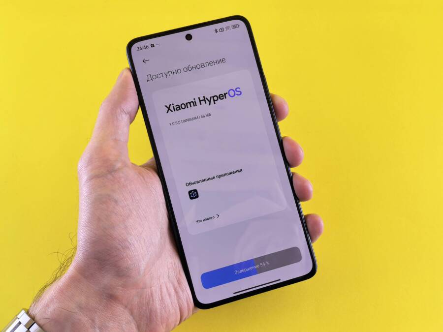
 Photo by Andrey Matveev on Pexels
Clearing App Cache to Reset Layout Preferences
Applications store small amounts of temporary data on your device, known as cache. This cache helps the app load faster by remembering settings, images, or even temporary layout information from the last time you opened it. Sometimes, if the app experienced a layout error before an update, a corrupted piece of cache data can get permanently stuck. This wrongly stored data might lock the app into an incorrect screen view, causing edges to be continuously cut off even when the system settings are correct. This process is particularly effective on Android, where app caching is more granular, but a full app relaunch after deleting cache can sometimes help on iOS as well.
When clearing this data, it is essential to distinguish between clearing the cache and clearing the data.
- Cache: This includes temporary files, thumbnails, and session data. Deleting this is safe and usually solves minor glitches.
- Data: This includes login information, saved preferences, game progress, and downloaded files. Do not clear data unless you are prepared to log back into the app and start that process fresh.
For Android users wanting to safely clear only the temporary memories causing display trouble:
- Go to your Settings menu.
- Navigate to Apps or Applications and find the specific tool experiencing cut-off edges.
- Tap on Storage within that app’s management screen.
- You will see two options: Clear Cache and Clear Data.
- Tap Clear Cache. Do not proceed to Clear Data unless you accept losing saved logins for that specific application on your smartphone.
After clearing only the cache, relaunch the app. If bad stored visual information was forcing the screen boundary violation, it should now load fresh from its source files, correctly calculating the size restraints imposed by your current device model.
Contacting the Developer for Unresponsive App Edges
If you have updated the application, confirmed no system settings are forcing a weird scale, and clearing the temporary cache hasn’t fixed the clipped edges, the fault lies squarely with the developer. They haven’t yet coded the application to correctly handle the specific display geometry of your smartphone, whether it involves a unique notch shape or an unusual aspect ratio. At this point, your feedback is necessary to prompt a fix. You need to report the bug clearly and politely so the development team can replicate the issue on their end.
You can locate the developer’s contact information directly through the app listing in the official store:
- Return to the App Store (iOS) or Google Play Store (Android).
- Search for the problematic application.
- Look for a section labeled Developer Contact, Support, or Information. This section usually lists an email address or a link to the developer’s support website.
When you write your report, provide concise, factual details. Developers love to see specific identifiers that narrow down the possibilities. Be sure to include the following in your polite message:
- The Exact Problem: Describe what is cut off (e.g., “The ‘Submit’ button at the bottom right of the payment screen is hidden.”).
- Your Device Model: State the exact model of your phone (e.g., “Samsung Galaxy S23 Ultra” or “iPhone 15 Pro Max”).
- Operating System Version: Include the OS version so they know the environment (e.g., Android 14 or iOS 17.4).
- App Version: If possible, state the exact version number of the app you are running. You usually find this in the “About” section within the app or the store listing.
By supplying this detailed information, you supply the map they need to find the hidden bug in their layout code. Many major software companies track user reports submitted this way, making it the final, effective step when all local troubleshooting efforts fail.
Conclusion
Resolving cut-off edges on your phone screen boils down to two main areas: system configuration and application code awareness. We established that most visual problems stem from the phone’s operating system—either adjusting settings like Display Zoom on iOS or Display Size on Android—or the app not correctly respecting the display’s Safe Area. If system checks fail, the next step involves ensuring the application itself is fully updated to recognize modern screen boundaries, or clearing corrupted cache data forced an incorrect layout upon startup for your smartphone. Having full, unobstructed access to every button and feature means you get the intended user experience from every app you install on your smartphone. Keep checking those settings, and enjoy working with your screen space restored.
He Was Drowning in Bills and Burnout Until a Simple Daily Ritual Rewired His Brain for Wealth in Less Than a Week
>>> Start Your Shift Today <<<